
LEGO Spaceship MOC: What Goes Inside the Hull
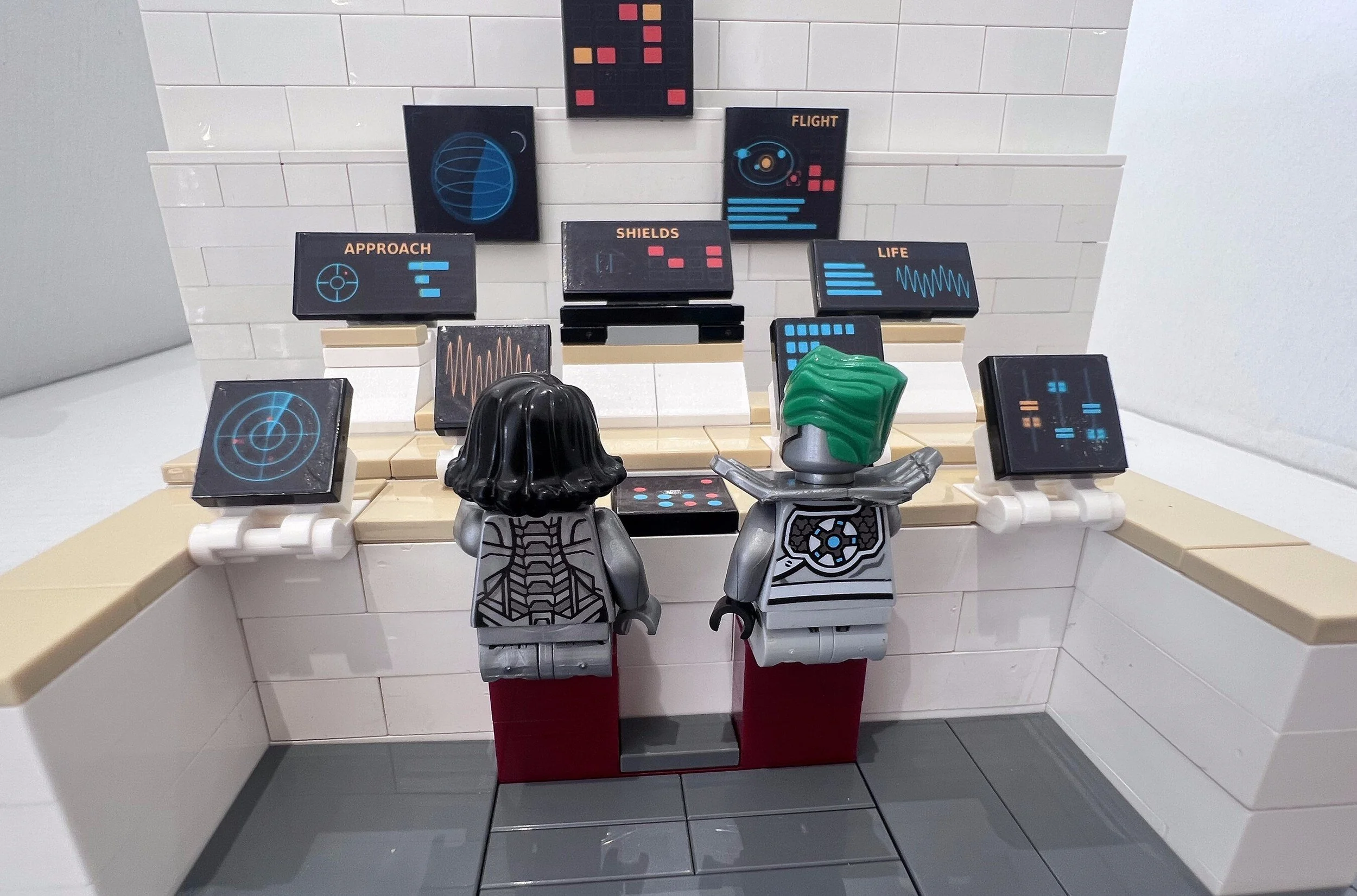
A LEGO spaceship MOC is usually built from the outside in. The hull comes together, the engines look right, the canopy closes, and then you look through it and the inside is bare studs and a single seat.
The cockpit is the part everyone details, and we have covered that already. What makes a ship read as a working vehicle is everything around it: the wall behind the crew, the bay they walk through, the panel by the hatch.
Group the panels by job
Real crewed spacecraft organise their instruments by what they do, and the grouping is visible. A name sits on a tab that breaks the top line of a box, and everything inside that box belongs to one system. Borrow that and your interior arranges itself. Four zones cover almost any ship: flight and navigation facing forward, power and distribution on a breaker wall, oxygen and pressure near the crew, and caution and warning somewhere all of them can see.
The power wall is the one that sells it
Nobody expects a breaker row, which is exactly why it works. A strip of switches that names both states, OPEN above CLOSE, with a bus voltage reading beside it, tells the eye that something is being managed rather than simply displayed. That is the detail people lean in for.
Put the caution panel where it can be read
On Apollo the caution and warning matrix was a grid of small square lamps, and the whole point of it was that a crew member could read it from anywhere in the cabin. Mount yours high and central rather than tucked beside a seat. Two amber cells among the reds is plenty. A full grid of red is texture, not information.
The era decides the instrument, not the colour
This is the one that catches people out. A modern bridge is screens: emissive graphics on near black, waveforms, target rings, and plain labels like APPROACH or SHIELDS. An Apollo-era cabin is dials and tape meters: black instrument faces on a light panel, round gauges, numeric drums, hazard striping. Recolouring a screen grey does not make it retro, and tinting a dial does not make it modern. Pick an era and let the instruments carry it.
Match the tile to the panel
Spacecraft Control Panels - Deep Space Edition is drawn for black tiles. The Retro Edition is tuned to light bluish grey. That is not decoration. We print on white-backed vinyl, so on a dark tile a cut a hair too wide shows a white sliver, while a cut a hair too narrow disappears. Matching the tile to the edge colour of the artwork absorbs a wobble in your scissors.
Between the two sheets there are a hundred and thirty-two designs, so most of the work is choosing rather than making. And if your ship needs something neither sheet has, a hull number, a registry plate, a name on the bulkhead, that is what custom LEGO stickers are for.
